

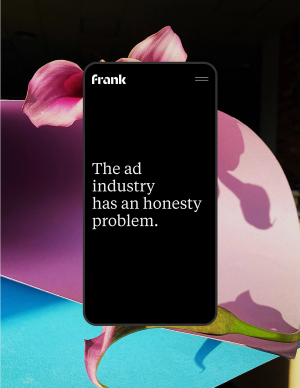
Frank is a creative agency that seeks to challenge the status quo of the ad industry; they believe that brave creativity starts with honest and sometimes uncomfortable conversations. The agency was seeking a visual identity system that communicates the space they’re creating in which these conversations and the work can exist.
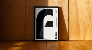
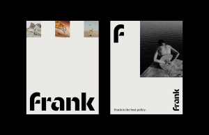
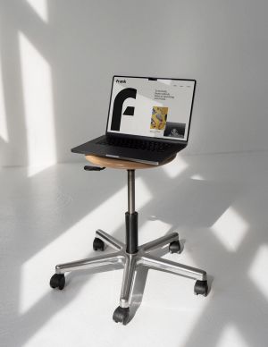
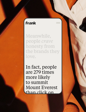
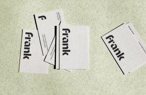
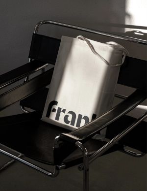
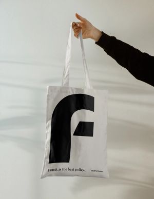
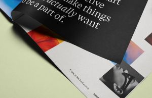
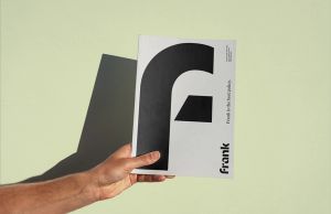
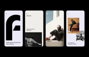
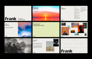
To do this, we created an identity that could be stripped back to its simplest form, and then added elements from there. With lots of negative space and a core palette of black and almost-white, there’s room for Frank to experiment and get a little messy in client work sessions. The unique stencil-based wordmark and secondary mark sit effortlessly amongst it all as powerful brand markers.





Creative Director: Elena MiskaWebsite Developer: Divelement